Five tips that have helped my hand lettering
When I was in fifth grade, I had a side hustle as a hand lettering artist.
I wrote the names of my classmates on a piece of construction paper in large block letters. I used a dark crayon to color in a shadow on the names, giving the letters a 3D effect. Finally, each commissioned pieced included my signature embellishment. I added a rainbow that spanned across the letters, but skipped over the background. I believe I charged 25 cents for each masterpiece.
My love for drawing words and writing in bright colors continued in high school. I completed as many of my classroom assignments as possible in multiple colors of fine tip Crayola markers. And even to this day, at the age of 51, I carry around a pencil bag full of felt tip pens and Sharpie markers and use them everyday to write my to-do lists, take meeting notes and doodle on scrap paper.
But it was only this year, during the pandemic, that I finally decided to get serious about learning the mechanics of hand lettering. I received hand lettering books and supplies for gifts throughout the years, but I would always resort back to my own style of lettering. Each time I tried to follow the “rules” of hand lettering, I got frustrated that I couldn’t seem to hold the pen at the right angle or quite master the thin and thick strokes.

**
Stuck at home with an overwhelming need to be creative this winter, I started going through all of the hand lettering tutorials I could find. I learned that pen selection makes a huge difference. And I discovered a few small tips that have made a big difference in helping me gain confidence in my lettering.

When I look at hand lettering artists on Instagram, I’m repeatedly convinced that I have absolutely zero ability. But what I lack in skill, I make up for in my passion for the subject. So, I thought I would share a few hand lettering tips from a novice that might help others to make small improvements like I have this year.

**
- The right pen makes ALL of the difference. I started the year watching dozens of hand lettering tutorials by Nicole Miyuki on the Let’s Make Art web site. I would carefully listen to all of her tips about holding my pen at the right angle and focusing on “thick on the down, thin on the up.” But the one tip I kept ignoring was her preference for using a Tombow Dual Brush Pen. Then one day, I remembered I had given my daughter several sets of these fancy markers for Christmas. I grabbed one, and my perspective on hand lettering changed instantly! I realized that creating strokes that were thick on the down and thin on the up wasn’t about the angle of my pen. It was about the amount of pressure I was using. With these brush pens, I could beautifully control the pressure. Armed with the right marker, I was obsessed with growing in my skill.
2. Next, I needed to think about the shapes of the letters. I learned from Nicole that hand lettering isn’t the same as nice hand writing. When you are hand lettering, you need to think of it as drawing letters. I printed out stacks of practice sheets from Scribbling Grace, a Bible journaling artist I follow. I traced her alphabet over and over again until I had memorized my letter shapes.
3. Now, I just needed to put it all together. And this meant slowing down. When you learn cursive, the point behind it is to help you write faster. In hand lettering, you have to slow down and think about each letter individually, rather than trying to write a whole word in one long stroke.

4. My next breakthrough was when I watched this tutorial by Danison Fronda. He showed how he uses a lightbox in his lettering. He writes the word first with a pencil on a regular sheet of paper. This allows you to only think about the letter shapes. Then he traces the word with a dark marker. This keeps you focused on your strokes. You put that piece of paper on a lightbox with a nice heavyweight paper over the top. Trace the word with the lightest gray pen that you have. Now, since you are only tracing, you don’t have to concentrate as much on letter shapes or stroke widths. When I go back and trace the word, I’m not as tense so it doesn’t look as shaky. Using a lightbox has helped me tremendously!

5. Finally, you can trace over the light gray outline with other colors of Tombow markers. Each set of pens comes with a clear blender pen. Because the markers are water based, you can go back over your work and blend the colors together. I love doing this! I often use a fine tip Micron pen to draw an outline around the word and then add a light gray shadow to make it stand out.
**

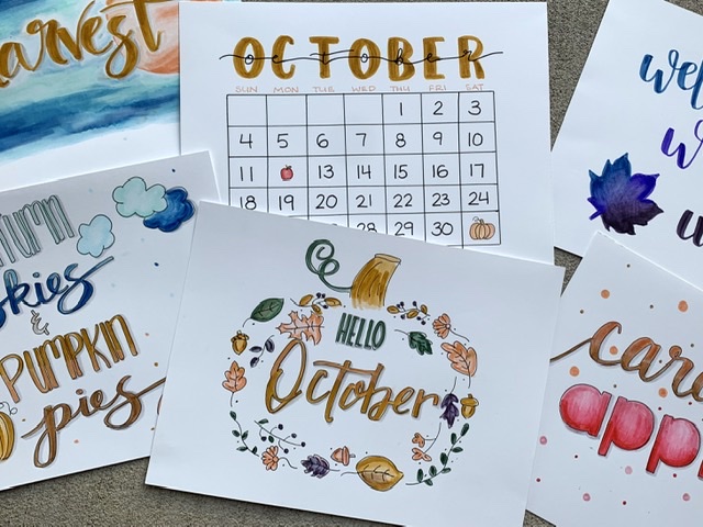
This month, I have been participating in a hand lettering challenge, writing a new word or phrase each day with a fall theme. It’s been really fun to practice my hand lettering every day. And after only the first week, I already feel like I’m growing in my skill and confidence!
If you have been interested in hand lettering, but feeling stuck, I hope some of these tips will help you as well!
But when in doubt, always remember that block letters with a rainbow spanning across them is a great place to start! 🙂
**

Discover more from
Subscribe to get the latest posts sent to your email.